
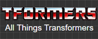
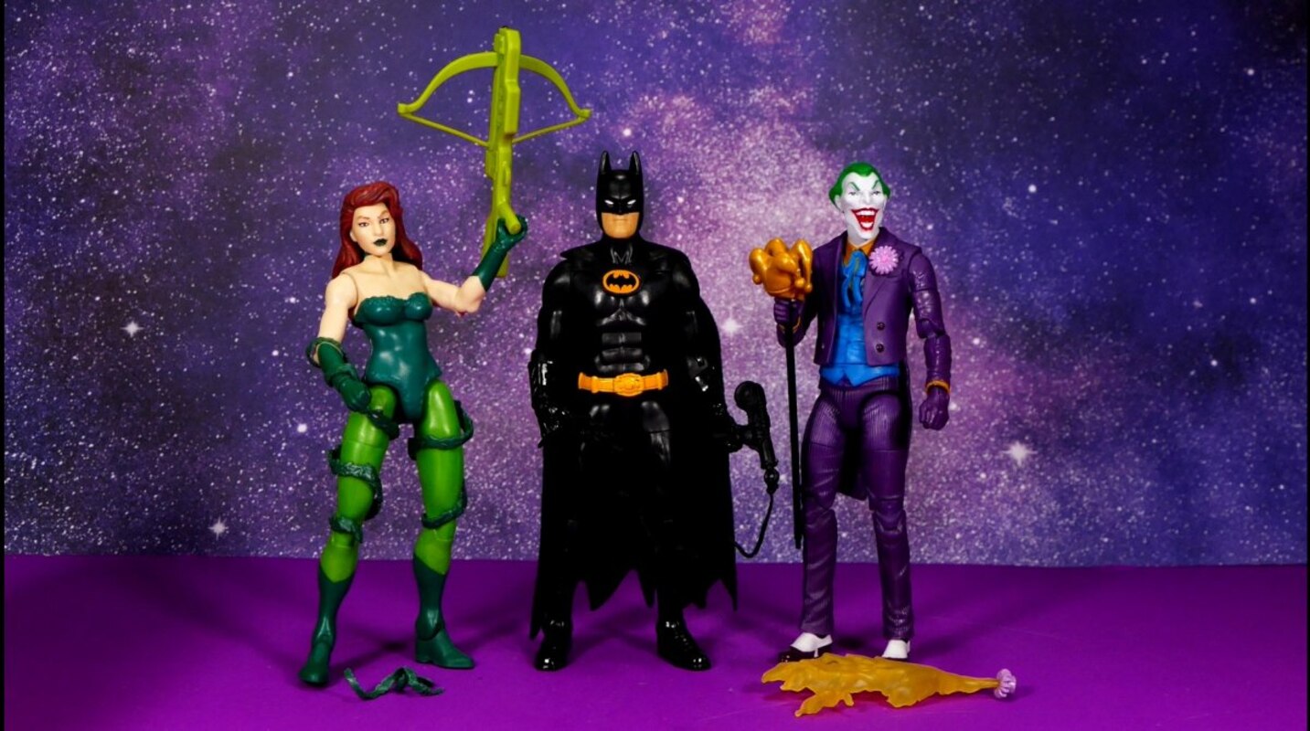
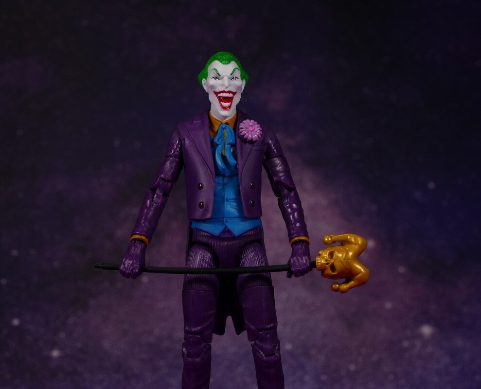
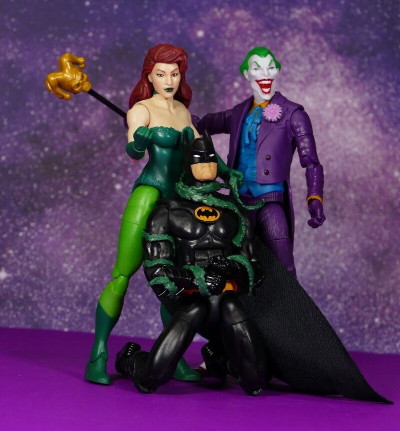
I get that Mattel is trying to give fans some kind of "updated" replica to the Toy Biz '89 line, but for the love of Pete, why package these on standard Mattel Multiverse blisters? Could they not use the gold with purple stars bordered cards? It comes off now like some kind of cheap effort, without the underlying context. Joker is the best of the line, looking more of a hybrid of the Super Powers Joker with the colors and "gimmick" of the '89 toy. Batman looks off, overlarge head, on a decent looking male buck. The "batrope" accessory is a nice nod to the original toy. Poison Ivy is ok, but proportions are off, breasts look awkward, fake like a pornstar, and like many of Mattel's DC efforts which led to their losing the license.
I love the idea of this wave but I have to agree with everyone else poor execution. Though Im not going to lie if I come across this Batman in the wild, I will most likely get it
Oh god. I thought Mattel was stepping up their game. ^_^ this doesnt look like it
I truly appreciate when such a grand collector does his part to help his fellow collectors decide which items to add to our own collections. I deem these 3 figures worthy of my collection
The head on Batman looks ridiculous.
I feel that the point of the line was to make thesefigure reallysimilar to old figures, and I guess they did manage it, however,figures usually always end up looking worse thanprototypes so that really didnt help the line, they look kinda funky.
For Poison Ivy: i like the body sculpt and the accessories but i do agree the head doesn't well for me neither.
For Batman: maybe the figure doesn't look bad and not even the head except it kinda looks big for my likes.
For Joker: that is some interesting figure there and while the headsculpt isn't perfect it looks decent to me, plus a neat staff alongside a good acid effect does the job well.
Jeez, that Ivy looks terrible. Batman's not far ahead, either, IMO. Joker does look like an excellent homage to the original, but I do not like that head sculpt.


__scaled_800.jpg)


